Part two: Project 3: Building three-dimensional structures

Project 3: Building three dimensional structures

Cairn (2019) Stevens, D. Height 350 mm; Stones

I chose cairns as the subject of my first in a series of four minor sculptures. Cairns are man-made stone mounds. They have been in existence since prehistoric times. The word Cairn originates from the Scots Gaelic term Carn. They have been used for a variety of purposes. In many parts of the world, they were used as markers on trails and waterways. They have been used for ceremonies, as burial markers, coastal guides and have also been linked to hunting and astrology.


I took to the beach once again. This time I would restrict my search to stones. Of course, these shores at Pett Level have an abundance of pebbles. To make things a little more interesting, I singled out stones with a maroon tinge. I gathered them up into my cloth sack and furtively made my way back to my vehicle. I’m not sure if it’s illegal to remove stones from the beach but hey ho. I placed the collection onto a work bench and admired my choices. Some weeks ago, I took some photos of these impressive cairns that had been assembled on the same beach. I think that experience may have subconsciously prompted my choice for this subject.


I began to sketch the pebbles as they lay in a disorderly pile on my workbench. I thought about the relief sculpture I’d created for project one. I wanted to avoid the mistakes I’d made with regards to adhesion. It was my intention to hot glue each stone and form a small table top cairn. It would be a futile exercise without suitable preparation. I laboriously coated each stone with a sealant. This would ensure good adhesion. I’d lost the matt look of the stones as they took on a polished lustre created by the sealant. It was as though they been washed with sea spray itself. I have a more sophisticated idea of how to construct the cairn. I would use a high- speed lapidary drill to bore holes in each pebble. I would then use 3 mm wire to join them together. I resolved to use the hot glue gun for economy of money and time.


I randomly glued the stones together. Starting with the larger stones to form a solid foundation, I worked my way upward in a spiral fashion. Each stone supporting the next one. I paused from time to time, standing back to see the cairns progress. I stopped once I’d reached the optimum 35 cm height. I felt pleased with my efforts with one exception. The appearance of the milky white, cooled glue oozing from each layer gave the game away.  I cheated a little as I took photos at certain angles in an effort to disguise this feature. On reflection, I suppose I could have painstakingly painted the glue with a suitably coloured acrylic paint.

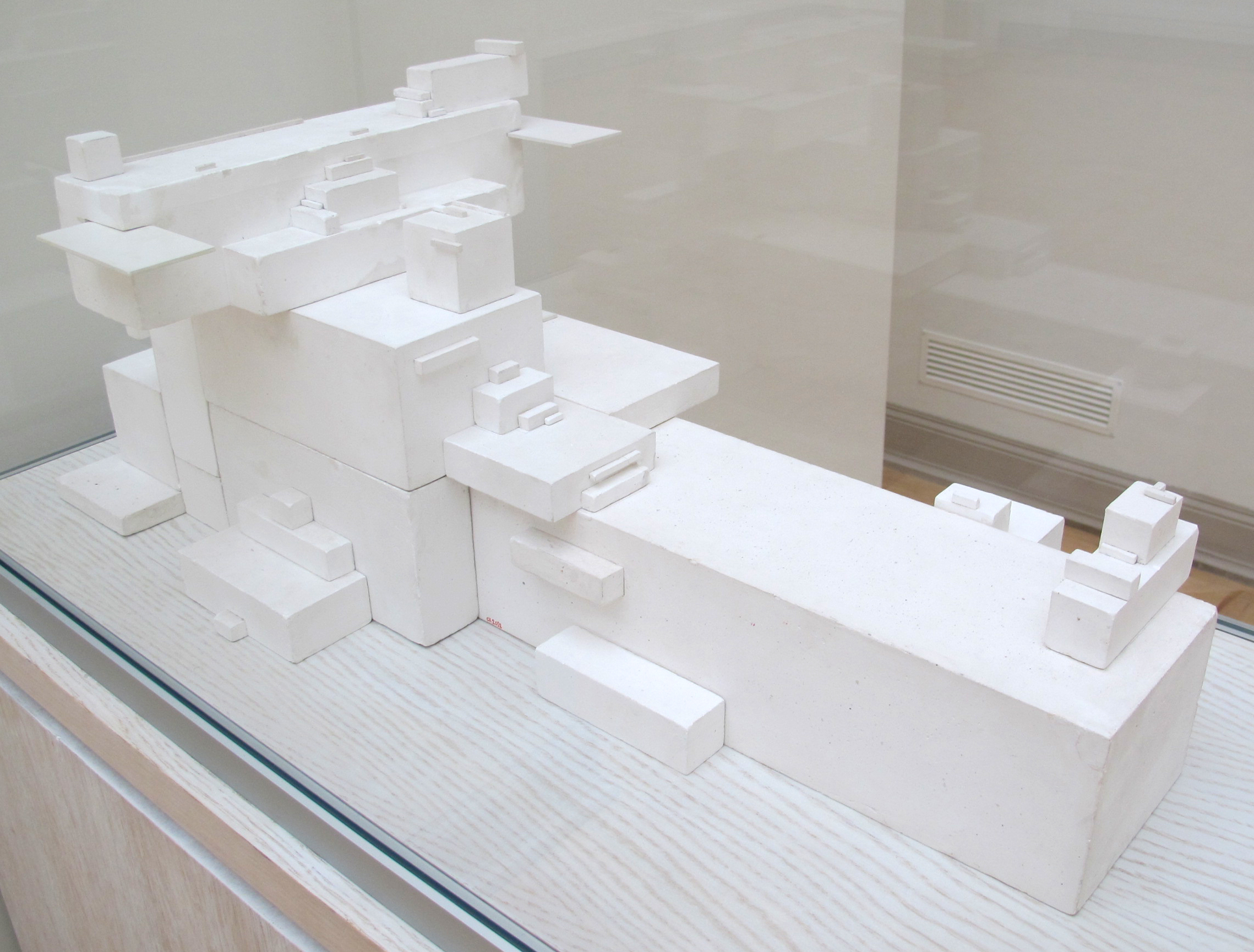
Metbox soliloquy (2019) Stevens, D. Height 350 mm; Metal and wood.

For the second in the series of small sculptures, I chose Malevich’s arkhitektons as an inspiration. This idea did not readily spring to mind. It was the result of a painstaking hunt through the drawers of a previous incarnation as an electrician. I discovered a stash of electrical socket, metal back boxes. These are made from galvanised steel and come in various sizes. I could see their potential straight away. They are riddled with fixing holes and internal threaded tags. I had the idea of bolting the boxes together much like Meccano. The open boxes could be placed together to give the appearance of solid block formations.


The plinth was cut from a fine piece of four by two-inch prepared pine. I screwed an open box on to the wood as a starter. This would act as a solid foundation. Fixing the boxes together required some thought. I had to drill strategically placed holes in each box. These holes had to align with the internal threaded tags. I developed the sculpture with a certain amount of randomness, twisting each piece this way and that. Akin to the style of German sculptor Stepan Siebers, the whole piece gives the illusion of improbable balance. I stained the wood using Colron wood dye.


Incandescent memoriam (2019) Stevens, D. Height 350 mm; Glass and metal.

Following another hunt through the garage, I found some old incandescent bulbs. These would be the inspiration for my third in the series of small sculptures. I began to construct a totem-like sculpture using the bulbs. It required deftness of hand. Of course, I couldn’t balance each bulb on top of another without a little help. I employed some Plasticine to fix each bulb in place. This method allowed me to experiment with a variety of positions. I found and used jam jar lids to separate each bulb, recalling imagery of  vintage, enamel candle holders. After some deliberation, I finally decided on a particular order. Start big and finish small, like a politician perhaps. The bulbs are the remnants of a pre-energy saving era. My aim was to present the sculpture as a memoriam to that era.


At the the next stage, I fixed all the pieces in place using a hot glue gun. I had hoped to get on to the painting at this stage, however, disaster struck. As soon as the brush hit the glass, the fragility of the piece became apparent. The hot glue gave way. It’s adhesive properties were sadly lacking for this particular job.


So, on to the final stage. I had decided from the outset that I would decorate the piece to give a weathered bronze appearance. I decided to paint each piece before assembly. I used the trusted Zinsser 123 primer for the first coat. This quality universal primer is great for virtually any material and dries rapidly. The second coat is my own recipe made up from an assortment of acrylics. To get the fresh bronze base colour you’ve got to aim at a drab olive hue. It looked ghastly at this stage. After that second coat had dried I moved on to the verdigris. Again, the verdigris was made up from a mix of different matt acrylic paints.


The application method is important when attempting to achieve an authentic quality. Smooth surfaces are more difficult than those with nooks and crannies. I made random daubing’s in short stages. I methodically wiped the verdigris with a rag before it had a chance to dry. It takes practise to get it right. I have done this many times before. The final stage involved the application of a metallic finish. I initially decided to use a bronze gilders wax. This had become dry over the last three or four years. Even with the addition of some white spirit, I wasn’t achieving the desired effect. I moved on to an acrylic metallic bronze paint. The trick with this paint is to use sparingly. Less is more. You can use a dilutant such as Liquitex but that’s for the faint-hearted. I used very light strokes with a small art brush to form a realistic effect. Upon completion, I super glued each piece into position. Finished.


Toy story (2019) Stevens, D. Height 350 mm; Plastic

I took another trip to the local charity shop for further inspiration. Of course, I’d much prefer to rummage around at a recycling centre, however, their strict rules prohibit the general public from foraging in their skips. I don’t know if this is a blanket policy across the UK, if so, that would be a shame. I understand the health and safety issues but what an untapped rich seam for the creative mind. I wasn’t sure what I was looking for. I had this idea about dolls heads. I would create a totem structure using plastic dolls heads. There were no dolls heads but I managed to find some small toys. They would serve the same purpose. For one pound I purchased a donkey, a toucan, an elephant and two recently popular toys called minions.


The original colourful state of the toys represent the vibrancy and promise of tender new life. I begin my construction by painting the items with the Zinsser 123 primer. To maintain stability of the proposed totem I need to drill holes in strategic places. I thread stiff 2 mm wire through the holes of each item. This allows me to experiment with different arrangements until I hit on the optimum. I  now placed each item on top of each other to seek out good balance.


I dismantled the totem and painted each item individually. I used some black, heat resistant paint for this purpose, no specific reason other than it was an old tin knocking around and needed to be used. This black background would serve as an antiquing effect to the final metallic coating. I wanted to create a sort of steam punk effect so I elected to use some copper wax for this final coat. I lightly rubbed the surface of the toys with a rag dipped in the wax. This action transformed the items into something quite remote from their previous existence. No longer viewed as toys but more a symbolic reference to the transience of time.


Red glass totem (2019) Stevens,  D. Height = 900 mm; Glass

I drove into Ore village to seek out some things to construct a totemic sculpture. I wasn’t sure what things but something was bound to jump out at me. There are two charity shops in the village, Macmillan and Sue Ryder. It was whilst I was rummaging through the shelves at the latter that I discovered a dust covered selection of red glassware. They were the sort of items that were all the rage in the 1960’s and 70’s. They seemed to sit there lonely and unwanted. They probably had at one time stood pride of place within a nicotine stained display cabinet in an otherwise dull living room. Perhaps they had clattered atop a hostess trolley pushed through shag-pile. Stored in a loft, the leftover relics of a sometime snuffed out soul. These effects are often the castoffs of the highest bidding house clearer. Looking beyond the kitsch value, I saw the translucent red glass with all its connotations as representing a naive bygone era.


I purchased eleven glasses and five decorative china saucers all for less than a fiver. Sadly, I broke one dessert bowl whilst exiting my car on arrival back home. I had already mentally constructed the totemic sculpture before reaching my studio. It was all a question of which order I would place the various glasses in. I wanted to retain the redness, make it stand out further. I thought that the clear glass stems would detract from the beauty of the translucent red. I painted each stem with Zinsser primer followed by a bland, neutral matt black. I wanted to use the saucers to give the piece the appearance of having tiers. I gave the saucers the same treatment.

http://

Once the paint had dried overnight, I began to experiment with different arrangements. I finally chose the brandy glass placed on a saucer as the base for the structure. I could only reach a certain height without permanently fixing each item. Too much would see the whole thing crashing to the ground. By this stage I had a mental picture of where each piece would end up. The saucers would be equi-spaced and topped off with the two tallest, elegant glasses. I used industrial strength super glue to fix each piece into place. Just out of curiosity, I thought I’d do some research … see if others have made totemic glass sculptures. It was a bit disappointing to discover that others have had the same idea and many examples put mine in the shade.


‘Red glass totem’ Large drawing using charcoal and acrylic paint. Dimensions: 1.25 metre x 70 cm’s. See also, Project 4.

Green Glass Totem (2019) Stevens, D.

I couldn’t resist another attempt.


Oxidation (2019) Stevens, D. Height = 900 mm; Polystyrene and metal.

I chose polystyrene as the medium for this totemic sculpture. It’s a material in abundance. I have many boxes full stored in my loft. I wanted to demonstrate how to create an illusion of weightiness using ultra light materials. I took inspiration from Malevich’s Arkhitektons, Jacques Schnier and the work of German sculptor Stephan Siebers. Much of his work centres on imbalance that in turn, relates to the human condition. It portrays emotional instability with a longing for security.


I randomly picked out several pieces. Using some 3 mm wire, I was able to construct several variations of my prospective sculpture. Once I’d decided on the final arrangement I began to construct the work using the wire and hot glue. I knew from the start that this was not going to end up looking like a pile of polystyrene. It was going to represent post industrialisation. A corroded hulk of unidentified machinery. Each piece stands precariously on another. A symbolic gesture to a gradual decline of the the old world order. A creeping realisation that the planet cannot sustain itself based on current economic models.


Before permanently fixing each piece into place I painted internal and ‘hard to get’ to areas. I used the Zinsser as a primer. I coloured this paint using different dyes to achieve a colour that closely resembled rust. This colouration will not show but is merely a safeguard in case the top coat finish reveals any untouched areas.


At the next stage I prepare my own recipe for what will be the true rust finish. It’s a process I devised about five years ago. I have sculptures that have weathered well in that period with no peeling or wearing off. It will adhere to anything.  I brush the concoction on to the primed polystyrene and leave to dry. This usually takes about three hours at  average temperature.


The next stage requires some protective equipment. Gloves, eye goggles and a suitable vapour mask. I recommend 3M 4251 for organic vapours. As this process involves highly corrosive acid it is advisable to wear suitable clothing and have a plan of action for spillage or splashes. I mix muriatic acid with hydrogen peroxide and brush on to the painted surface. After a couple of hours I use a watering can to sprinkle my activation solution on to the sculpture. Rust will begin to develop after three or four hours. The natural elements will accelerate this reaction.


‘Oxidation’ Large drawing using charcoal and water colour. Dimensions: 1.25 metre x 70 cm’s. See also, Project 4.


Part one: Project 2: Open-space construction

Project 2: Open-space construction

‘Aqua’ (2019) Stevens.D. Metal, plastic, glass and concrete.  60 x 150 cm

I chose the translucent red tube because it represented a conduit for water. Water was my subject of interest. I set about sourcing any discarded items that I could use to construct a sculpture that might portray my subject. I found a plastic watering can. I decided that this might be useful as the main focus. I drilled a large hole at the base of the can. The hole was big enough to fit snugly around the red tube. For rigidity, I hot glued them together. I considered the stance, poise and weight when deciding on the base. I needed something of considerable weight but not too showy. I found a small concrete block with a hole. This was perfect. The diameter of the hole was a little too large so I had to think about how I could secure the tube to the block. I placed the tube in the hole and poured Crystacal plaster into the cavity. The weight of the block allowed me the freedom of adding weighty objects whilst maintaining stability.

The beginnings
Building an idea
A plinth?


I now had the bones of the subject but I had to think about where this idea was going to lead me. How could I expand beyond this basic shape? Of course, there is so much to say about water, vital in sustaining all known forms of life on earth. I thought I might choose mundane but contrasting objects. This approach had all the possibilities of translating into the different ways in which water is regarded in both developed and developing countries. I thought about so many issues surrounding water. The Water Aid project calculates that 844 million people don’t have nearby access to clean water. Well over two billion do not have a toilet. Here in the UK, many are disgruntled at any suggestion of a hosepipe ban. I found an old car wing mirror and glued it to the filling hole of the watering can. Can I just look at myself for a moment? Can I feel easy about watering the petunias in the garden when confronted with these uncomfortable truths? The watering can is ‘holding a mirror up to society’.

Holding the mirror up to …
Tap and hose added


Each particular element in combination with the subject could have multiple connotations. There are current concerns about plastics contaminating the world’s oceans. Should the water ‘industry’ be in the hands of private companies? Why are golf clubs exempt from hosepipe bans? Industrial and agricultural expansion is contributing to drought conditions across the world. What is being done to tackle these problems? The sculpture needed more aquatic touches. I resolved to throw the kitchen sink at the structure. I found an old shower hose and a brass tap. I fixed the hose to the side of the watering can. I had to glue a threaded fitting in place to accommodate the hose. The hose was a bit flimsy. In order to give it some shape, I placed stiff but malleable wire inside the hose. This allowed for some creative coiling. I glued the brass tap into the spout and attached the other end of the hose. The diagonal lines of the watering vessel express a feeling of movement. Its position suggests instability whereas the vertical lines of the Perspex tube convey a sense of height and importance.

I bolted a rather uninteresting piece of wood on to the tube in a horizontal position. Could this be made to subliminally symbolise the death of marine life? I found some 3 mm wire and some plastic mesh. Already, I’m thinking about a shrimp net. This could lend itself to the theme. I fashioned and cut the wire into a semi-circular shape. I drilled a 4 mm hole at each end of the wood and fed the wire through. I glued each end into place. I then placed and glued the mesh over the wire and trimmed the excess with scissors. These additions seemed to add greater stability. At this stage, each part is relating one to another. I have an overwhelming urge to spray paint the entire composition. I want everything to appear uniformly neat and clean. Could a neutral shade better expose sharp lines? The existing cacophony might strike a discordant note and perhaps that is what I’m subconsciously trying to achieve. Am I aiming for harmony or conflict?

Four millimetre hole
Feeding the wire


Sketch in pencil and charcoal
Adding and trimming the mesh
Enmeshed

I left my sculpture for a few days and concentrated on my research. Upon returning with fresh eyes, I felt I needed to add one or two items. Of course one has to draw the line somewhere. I decided to add a sink waste trap and a water symbol made up from wire strapping, wire and two circular cuts from a drainpipe. Any more than this and the project would present as too busy in my opinion. I glued the trap on to the can using my hot glue gun. Again, using the gun, I fashioned and affixed my symbol to the highest point. This whole process has ignited the critic within me. If I’m honest, aesthetically speaking, I don’t like my creation. This could have gone better but I can take comfort in the knowledge that my endeavours will improve with practise.

Symbol assembly
Cutting the circles for the symbol
Affixing the trap
Affixing the symbol
Aqua: Pencil and watercolour
End game 1
Aqua: Pencil and water colour
End game 2
Aqua: Pencil
End game 3


Part two: Research: Developing construction

Research point: Developing construction

Jacques Schnier (1898-1988)
Cubical Variations Within Rectangular Column (1961)
After abandoning figures post WW11, Schnier went on to sculpt in a style related to Cubism. He explored the relationship between volume and space within geometric forms. From the late 1960’s onward, he experimented and incorporated industrial materials into his work.

Schnier 1960
Cubical Variations Within Rectangular Column (1960) Schnier, J

Peter Startup (1921-1976)
Falling Figure (1960) Wood
Startup’s sculptures were attentively fashioned. They usually consisted of two or more forms of wood. Further unrelated materials were often inserted into the pieces. His work wavered somewhere between figuration and abstraction. Many of his sculptures are flexible. They comprise elements that can form disparate arrangements. He began using ‘found’ wood by the end of the 1950s. He developed an idiosyncratic topic featuring wood figures. These were assembled in a basic, haphazard style that defied and rejected the practice of fine joinery. Startup said of the confliction of his chosen components, ‘they are part of the discarded junk of urban life and through them, I want to find relationships which surprise and excite me and that project an image through the terms of classical sculpture- that is, in terms of space and volume’. Startup used wood as his preferred material for his assemblages. These pieces took on totemic, metamorphic forms.

Falling Figure / Shuttered Figure (1960) Startup, P.

William Turnbull (1922-2012)
Idol 2 (1956) Bronze
Turnbull produced five sculptures bearing the title ‘Idol’. Each piece resembles a standing female character. Idol’s 1 and 2 are overly figurative, whereas 3 and 5 are more geometric with 4 being markedly smoother. For Idol 2, Turnbull embedded corrugated cardboard within the plaster. The resulting ribbed texture defines the breasts, legs and hair. On writing about Turnbull’s 1973 Tate retrospective, Morphet (1973) noted how the sculptures resembled ‘archaic spearheads or blind sentinel’s’. He goes on to suggest that the figures flat and still features relate more to those of Egyptian and Ancient Greek origin. The title ‘Idol’ refers to contemporary ‘screen idols’ and those of pre-history. These high and low references aid our understanding of modern culture. As viewers, we are besieged by imagery past and present.

Idol 2 (1956) Turnbull, W.


Constantin Brancusi (1856-1957)                                                                                                      Endless Column (1937), Steel & Bronze Paint, Targu Jiu, Romania

Endless Column 1938) comprises fifteen hollow, giant pellet-like segments. Each piece is stacked to form the towering ninety-six-foot-high sculpture. Half sections are placed at the base and the summit. The entire piece is made from cast iron and sprayed with a metallic bronze finish. If you were to stand close by and glance up toward its ascending form, the work would appear to be a boundless litany of edges and planes. Its element of simplicity has a deceptive quality. It allows the viewers imagination to run riot with its repetition. Paradoxically, the column seems to have more edge than plane. The zig zag, razor sharp edges seem to cut into the sky in two parts whilst seemingly binding it back together. Its weird how this column counters the laws of one-point perspective. According to George (2014), one might expect to see the sections decrease in size as the column soars but they remain the same when viewed in the flesh. A fine example of the gap between perception and what is actually visible.

Endless Column (1937) Brancusi, C.

Brancusi’s figurative works such as Adam and Eve 1921, may well have been inspired by African sculpture. These sculptures show a clear relationship to the ‘primitivism’ inspirations he’d experienced early on in his career. Paul Gaugin’s use of direct carving to re-create the organic nature of indigenous, Tahitian carvings appear to have influenced Brancusi’s work. It is easy to see how some scholars argue that Brancusi’s work might also have been inspired by the Romanian folk carvings from the country of his origin. Brancusi’s work encompasses architecture, furniture and sculpture, whilst evoking spiritual reflection.

Adam and Eve (1921) Brancusi, C.
‘Kopjafa’ Romanian grave marker.


Julio Gonzales

Julio Gonzales’s creative period occupied a relatively short space of time. War and poverty was manifest in his work. He associated with the local traditional crafts of Barcelona. This was to influence his take on form and his preferred medium, He’d attained a high level of welding skills during the first world war. Those skills would allow him to express paradoxical, broad-ranging concepts. His sculptures encompass a variety of abstract forms attributed to surrealism, constructivism and cubism. He collaborated with Picasso and is renowned as the ‘father of iron sculpture’. Gonzales chose iron as his medium in protest of its use for munitions and the mechanisation of society.

Gonzales drew inspiration from Picasso’s approach toward communication between painting and sculpture. This led Gonzales to interpret forms in space within his own output. He appreciated space as a new medium with which to construct and shape his art. He would go on to formulate his ‘drawings in space’. This method utilised the surface and lines in the sculpting materials. He produced open constructions using space to represent the human body or female figure. Gonzales used drawings as a means to test out new ideas when the availability of materials was limited. The drawings emphasise the effect of shadow and light on the architecture of spatial form. The influence of 16th-century artist, Luca Cambiasso can be seen in Gonzales’s work, often depicting human figures in cube form. Gonzales influenced the works of David Smith and Anthony Caro.

During my research I found the following contemporary sculptors working in a vertical way.

Jose Davila (1974)

Davila is a Mexican sculptor. He employs a variation of replication procedures that deconstruct the relationship between content and form. His education as an architect and self taught historian is evidenced in his body of work. This work queries the boundaries of contributory values over the adoption of familiar elements in the creation of objects, sculptures and installations. His work relates to Arte Povera and Minimalism. His interest lies within the occupation and use of space. The image below is part of an installation titled ‘Not all those who wander are lost’. It was presented at the Royal Botanical Gardens in Madrid. The installation hints at the history of sculptural language that takes in the different functions of columns. From construction support and decoration, through to totems used for religious and spiritual purposes. His work pays homage to Mexican architect Luis Barragan and sculptor Donald Judd. Using building material and found objects, he merges industrial with organic. Classical and Minimalist aspects are brought to the fore.

Pencil and watercolour
Not all those who wander are lost. Davila, J. (n/d)


Giorgio Andreolla Calo (1979)

His work centres around large site specific installations. His spatial works alter both landscapes and remnants of buildings. They generate a connection between the symbolic aspects of water, fire and light. Calo prefers to work in wood, bronze and clay. Much of his work appears totemic with overtones of deterioration. Untitled (2015) appears to make reference to the work of surrealist sculptor Giacometti. Calo’s mix of mysterious imagery represents a resurrection of totems that give a sense of primative humanity. Calo explains; “I am more interested in the paradox of adopting a system so old that it stems from the origins of figurative art to create a contemporary vision of the present, and to do it in a place given over to the art of our times”.

Untitled (2015) Calo, G.A.

Tony Cragg (1949)

British sculptor Sir Tony Cragg places no limits on the materials he uses for his creations. His works appears to blur the lines between natural and man-made landscapes. He interprets sculpture as an examination of how matter and its varied forms alter our concepts and the sentiments they evoke. Cragg explores the link between why we look as we do and why we are the way we are. Point of view (2004), takes on totemic qualities, however, the impression of permanence becomes subverted with the creative way in which he utilises polished steel. The work resembles an aquatic Archimedes screw that reflects the fleeting, delicate nature of water.

Point of view (2004) Cragg, T.

Peter Bradley Cohen (1960)

Much Bradley Cohen’s works are vertical in style. The former advertising agent took up art full time three years ago. He works with metal and found objects. His sculptures portray improbable physics. Much of his works appear to be heavily influenced by Caro. He analyses the balance and tension betwixt organic fluidity and geometric rigidity, weight and illusion of weightlessness. His work seeks to instil in the viewer, the idea that they have stumbled upon something random. His interests in cultural and spiritual objects influence the totemic style of his work.

Black and red totem (2016) Bradley Cohen, P.

Evy Jokhova (1984)

Jokhova experienced a multicultural upbringing exposing her to varying political and social structures. Her background influences her practice and research. She is a multidisciplinary artist that engages with relationships and discourse between architecture, sociology, art and ideology. In a recent project, Cairns; Totems, Jokhova explores the link between the developmental significance of religious objects, assemblages for shrines and crusades in modern culture. She analyses their materiality, imitation, physicality, creativity and balance. Cairns is a tribute to the human act of stacking stones. This practice is represented in mythology, spirituality and politics. Jokhova’s work emulates the totemic nature of cairns. She uses modern materials in place of real stone.

Totem 111 (2015) Jokhova, E.
Cast cement, acrylic polymer and stone effect on polystyrene, clay, wood, furniture wheel, wifi tablet
40 x 40 x 130 cm
15 3/4 x 15 3/4 x 51 1/8 in


Reference list:

Artprice.com (n/d) Biography of Jacques Schnier (1898-1988) [online] Artprice.com. Available from: http://biography of Jacques SCHNIER (1898-1988)  [Accessed 18th April 2019]

George, H. (2014) The elements of sculpture. London. Phaidon Press limited.

North House Gallery (n/d) Peter Startup (1921-1976) 30 Years of Sculpture [online] North House Gallery. Available from: http://www.northhousegallery.co.uk/art-exhibition/artist/peter-startup-19211976/30-years-of-sculpture/ [Accessed 18th April 2019]

Spector, N. (2019) Constantin Brancusi, Adam and Eve 1921 [online] [Wood] Collection Online. Guggenheim. Available from: https://www.guggenheim.org/artwork/663 [Accessed 20th April 2019]

Tate (n/d) William Turnbull, Idol 2, 1956 [online] Tate. Available from: https://www.tate.org.uk/art/artworks/turnbull-idol-2-t05801 [Accessed 18th April 2019]

Images:

Archiveofaffinities (2012) Jacques Schnier, Cubical Variations Within Rectangular Column, 1961 [online image] Eyeball Mansion. Available from: http://eyeballmansion.com/post/25511965770/archiveofaffinities-jacques-schnier-cubical [Accessed 19th April 2019]

Dalf (2006)  Constantin Brancusi, Endless Column 1938 [online image] [Bronze] Creative Commons. Available from: https://de.wikipedia.org/wiki/Datei:Romania_20060512_-_Tirgu_Jiu_-_Coloana_fara_sfarsit.jpg  [Accessed 20th April 2019]

Poussin Gallery (n/d) Peter Startup, Falling figure/ Shuttered figure 1960, [online image] [Wood] Poussin Gallery. Available from: https://www.poussin-gallery.com/site.php?artist=11&group=archive  [Accessed 18th April 2019]

Unknown (2019) Constantin Brancusi, Adam and Eve 1921 [online image] [Wood] Collection Online. Guggenheim. Available from: https://www.guggenheim.org/artwork/663 [Accessed 20th April 2019]

Unknown (2018) The Szekely wood [online image] [Wood] Cristuru Secuiese, Culture and Tradition. Available from: http://www.enterrural.com/szekely-wood-carving/ [Accessed 21st April 2019]

William Turnbull (n/d) William Turnbull, Idol 2, 1956 [online image] [Bronze] William Turnbull. Available from: http://williamturnbullart.com/index.php/the-art/sculpture/idol-2/1946-1962 [Accessed 18th April 2019]

Part one: Project 1: Shallow relief sculpture

Shallow relief sculpture

So, straight in at the deep end. This was my first attempt at constructing a shallow relief sculpture. Choosing a subject seemed like a simple suggestion but had me flitting from one idea to another. I finally settled on a marine theme. I could find plenty of useful objects along the coastline. I resolved to find a mix of organic and man-made items. I wanted to create something erratic and unsettling. I must live near one of the cleanest beaches in the UK. My search was not only hampered by gale force winds but there seemed to be a lack of material. Following a long trudge across the pebbles, I managed to collect enough ‘found objects’ for my project. Pett Level finally relinquished its treasures. My hoard consisted of random, smooth pebbles, many shells, driftwood, plastic odds and ends, a fishing net and a child’s beach shoe.

Observational A3 drawings of my collection of objects.


Tonal drawings on A3.


Trying out different arrangements.


I cut a square from plywood board. Measurements 60 x 60 x 1.8 cm. I smoothed the edges with sandpaper and gave it a coat of oil-based undercoat followed by a coat of white acrylic paint. I scattered all of my found objects onto the dry board. At this stage, I started to let my mind wander. What was it that I wanted to achieve? I wanted to be radical and create something that would convey a message. The beach and my collection got me thinking about asylum seekers. The treacherous journeys that some undertake. The child’s shoe amidst a pile of shells re-enforced this idea of highlighting the plight of people fleeing persecution. I had difficulty determining what was meant by subject. Was ‘subject’ the beach, the collection of items, the asylum seeker idea or the concept of the proposed sculpture? I needed to know exactly what I was supposed to sketch. I eventually settled on different formations placed around the board.


Each arrangement had its merits but all had an uneasy look. Initially, I think I tried too hard to achieve something pretty or easy on the eye. I finally decided on a mix of twee and random that would reflect my thoughts. I placed the shells along the four edges of the board, alternating the position of each one as I went along. This created a twee framing for the shambolic confusion that lay within. The juxtaposition of the natural elements and the child’s shoe seemed to accentuate the idea of treacherous sea journey’s made by refugees. Those that survive and reach dry land, encounter yet another hostile environment. They are often met with indifference and resentment from their new host country.


I glued each piece to the board with a hot glue gun. I affixed two mirror brackets and hung the piece on a white wall. It wasn’t long before a couple of large pebbles fell to the floor. The porous nature of the pebbles proved to be incompatible with the glue. I decided to coat the underside of the pebbles with a sealant and this resolved the problem. The work was crying out for something more profound. I remembered I had a pile of small human skulls in my studio. These were produced from a small silicone mould and had accumulated over many years. They were testers for different materials. I placed four of these skulls within the frame. The skulls would represent the one in eighteen refugee lives lost at sea between January and July 2018 (UNHCR figures). My composition had now taken on an uncomfortable look. I took things a stage further by adding red paint. I was reticent to start. Was I going too far? maybe. It was an uncomfortable truth so no point in holding back. I can now stand back and appreciate the boldness of the work.


The red coating lends a stark uniformity to an otherwise blunt, bland formation. I lost the contrasting colours of each item but gained greater depth. Red is an emotionally intense colour synonymous with strength, passion, war, power and blood. I did encounter an unexpected problem when photographing the finished work. I discovered how reflective the colour can be. The use of a gloss finish seemed to exacerbate this. The photographic imagery loses something. It seems flat and out of focus. The photos still capture the elements but not to the desired degree. It certainly looks better in the flesh. I did leave the work hidden for some days. On my return, it still resonated with me. It’s still unbending and uncomfortable to view.


Part one: Construction and drawing:

Research point

Arkhitektons: Kazimir Malevich

Malevich began the Suprematism art movement in 1913. It concentrated on basic geometric forms like cubes, lines, rectangles and squares. It’s interesting to note the similarities between Ben Nicholson’s c.1936 (Sculpture) and that of Malevich’s Arkhitektons. Malevich’s three-dimensional models bear a resemblance to skyscrapers. His accompanying drawings are called ‘planits’. The models are mostly made from plaster rectangles added together. They usually consist of a large central block as the main element with additional, smaller parallelepipeds. No function is demonstrated or interpreted by form. The end results are pure assembly of abstract vertical and horizontal masses. According to Fabrizi (2015), they embody formal non-objectivity and spatialization. These Arkhitektons demonstrate Malevich’s attempt to convert his suprematist doctrine of composition to that of architecture and 3D forms.    

Kazimir Malevich: Arkhitekton Alpha (1923)
Kazimir Malevich: Arkhitekton (n/d)


Wagon II 1964: David Smith

This sculpture is one of a series of three. Consisting of forged steel, it was cast at a commercial foundry called American Forge. The extra-large fourth wheel was manufactured from five steel plates welded together. The sculpture was exposed to the elements for one season. The accumulated rust was then removed. It was finished with a coat of Masury oil. Smith quoted ‘the red of rust has a higher value for me than antiquity relationship. It is the red of the east’s mythical west. It is the blood of man, it was on culture symbol of life’ (Marcus p.158). Each of the smaller wheels weighed 275 pounds and were originally intended to carry the weight of a hundred-ton trolley car.

David Smith: Wagon 11 (1964)

Eilis O’Connell

O’Connell’s abstract sculptures are influenced by her interest in architecture, archaeology, found objects and geometry. Equally, she instinctively uses organic forms, drawing her inspiration from the body. She uses a variety of media but metal is her favoured medium. Much of her work is large scale. O’Connell shuns the use of CAD programmes, preferring to make 3D scale models of her projects. Below are three objects based on geometrical spiral forms. They were made from resin and carbon fibre.

Eilis O’Connell: Stem (2008)


Eilis O’Connell: Loop (2008)

Eilis O’Connell: Curve to point (2008)


Reference list

Fabrizi, M. (2105) Kazimir Malevich’s Arkhitektons [online] Socks. Available from: http://socks-studio.com/2015/07/15/kazimir-malevichs-arkhitektons/[Accessed 30th March 2019]

Gale March, M. Revised (2001) David Smith: Wagon 11 (1964) [online] Tate. Available from: https://www.tate.org.uk/art/artworks/smith-wagon-ii-t07516  [Accessed 30th March 2019]

Bibliography

Marcus, E. (1983) David Smith: The Sculptor and His Work, Cornell University Press, London.

Images

Unknown (n/d) Wagon 11 [online image]. Art Fund. Available from: https://www.artfund.org/supporting-museums/art-weve-helped-buy/artwork/7180/wagon-ii  [Accessed 30th March 2019]

Unknown (n/d) Eils O’Connell [online] & [online images]. Cass Sculpture Foundation. Available at: http://www.sculpture.org.uk/artist/eilis-oconnell [Accessed 30th March 2019]

Unknown (n/d) Arkhitekton Alpha [online image]. Available at: https://upload.wikimedia.org/wikipedia/commons/b/bb/Kazimir_malevich%2C_alpha_architecton%2C_1920_01.JPG  [Accessed 30th March 2019]

Unknown (n/d) Arkhitekton [online image]. Available at: https://thecharnelhouse.org/2014/03/12/suprematism-in-architecture-kazimir-malevich-and-the-arkhitektons/#jp-carousel-18118 [Accessed 30th March 2019]